Lately our posting schedule is extremly irregular and episodes take forever to post up. We're planning to get back on schedule soon. So, in the mean time let's take a look at our past artworks and look for clues that will lead to the upcoming episodes--and they're worth the wait, we promise :)
MIMC artworks (posters, banners, videos, etc...) had been a great part of the fanfic. In my own personal beliefs, the fanfic wouldn't be where it is if not for the artwork that played the role of promoting it. Let's take a look and see how things have evolved over time and all the artwork that wasn't made available to the public's eyes.
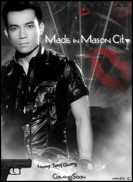
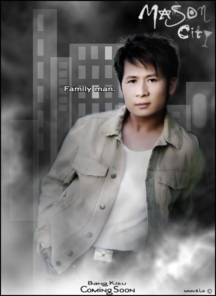
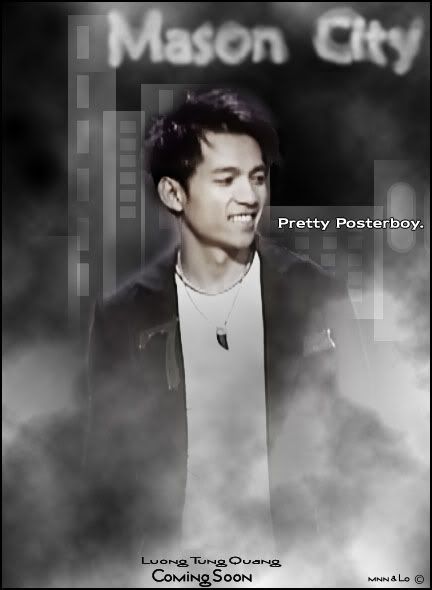
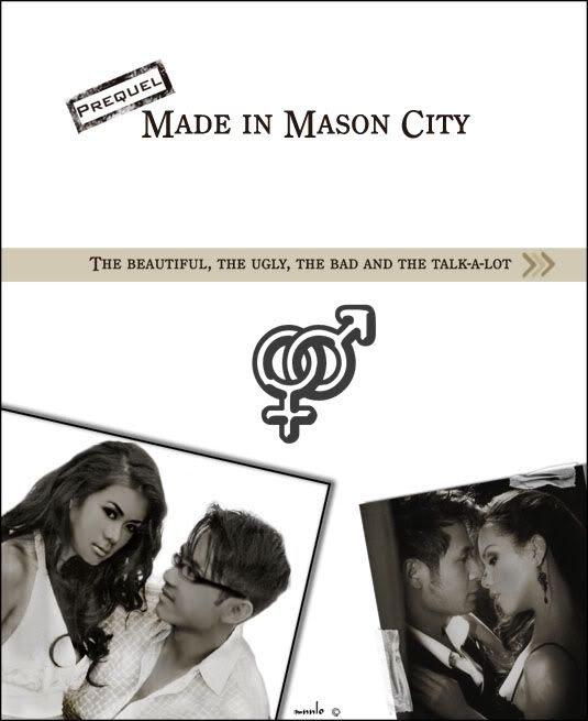
These are the first MIMC posters. As you can see, black and white is something that we use very often. It separates MIMC from the rest of the fanfics, since others often use bright, colorful posters to promote their fanfic as it catches the eye of the reader more. We figured that using black and white among all the other colorful artworks will make it stands out more.
As you can see, there isn't a poster for Bang Kieu by himself in this edition. Originally, we did have a poster for him but as it turns out, that layout wasn't used and on our second try, which restults in these posters you see here, we were out of time and didn't make one for Bang Kieu, for we didn't think he'll become such a big role in the storyline.
Ones that didn't make it:
Why: Background wasn't even close to real and the title seemed "cheesy"
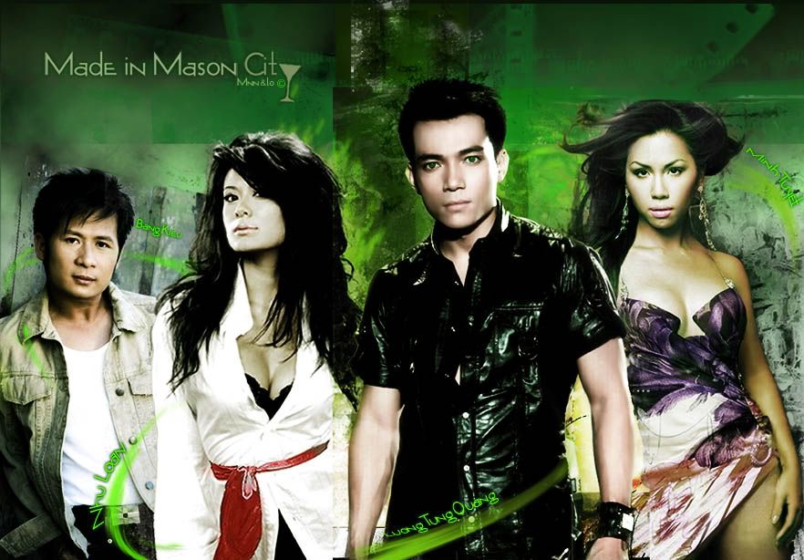
OFFICIAL POSTER of SEASON 1
This was the best artwork done by the creator at the time (hint: now you guys all know who's writting this.) It has more colors because a lot of people prefered colors to B&W and being a new fanfic, we needed to get as much attention as possible.
However, on looking back, there are a lot of things that could've been done to improve it. Ex: The skin tones of each character varies in a way that makes them looks like they were cut and paste, rather than the idea of making them looks like they took the picture together.
Ones that didn't make it:
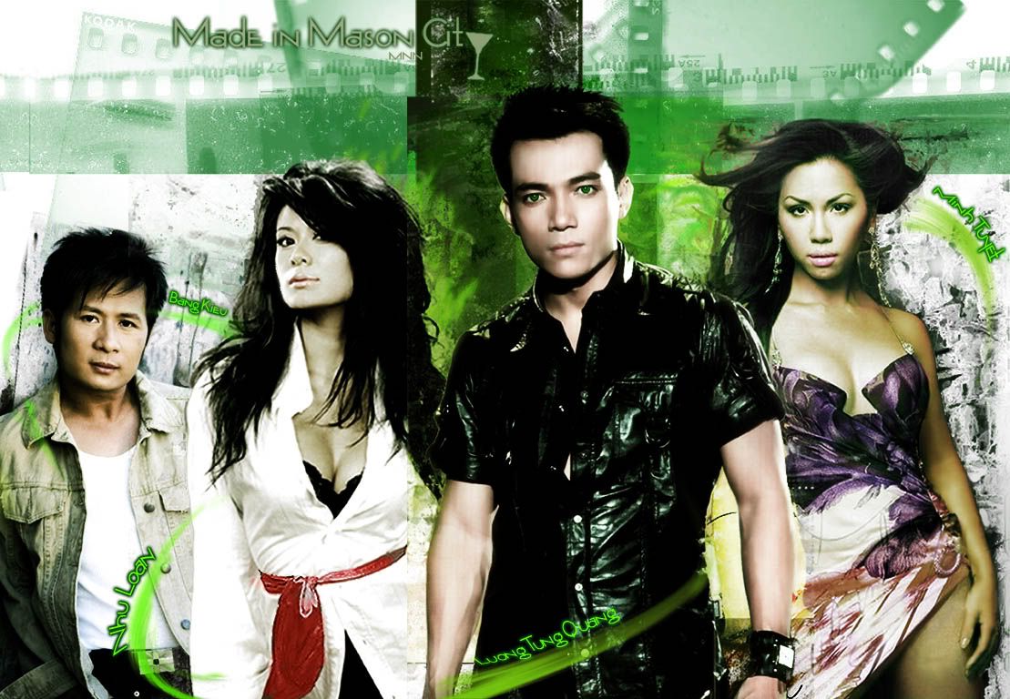
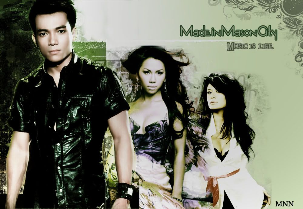
Why: (1st one)The tone of the story was dark, therefore it makes no sense in having a white background. Besides, the darker one looked better. (2nd one) This was originally made to be a background for a myspace. It was the one that the other posters are based on.
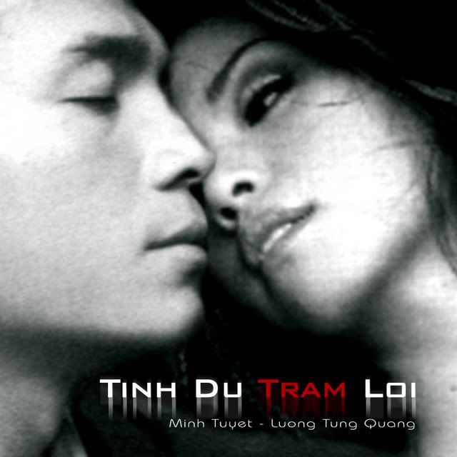
It was to go along with one of our episodes--the beginning of the infamous on-screen couple LTQ and MT. Their relationship are loved by the readers. It became so succesful that we decided to incoporate it into the rest of the season.
MNNLO's creations. This had little do with the fanfic besides the fact it has the two main character in it. However, it's one of the few graphics where we both put some work into it rather than one making it and the other reviewing.
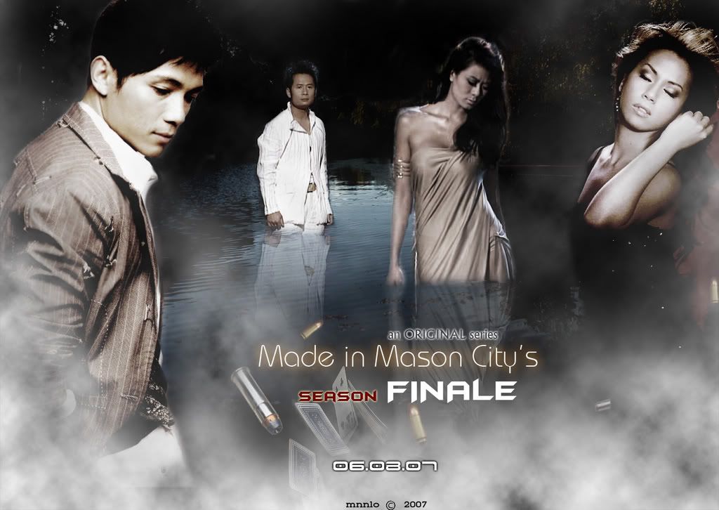
FINALE POSTER
Up until now, this remains the best poster of MIMC in our opinion. The problem of skin tones remains no longer. The idea of them being in a "swamp" (that was supposed to be a lake) is to say that they're sinking deeper and deeper into the underworld of Mason City. Coincidently, it also hints that they're going to be stuck on an island in Season 2 due to a plane crash. Luckily, all it took was one try and there are no other versions of this poster.
Bang Kieu fans may also complain that he gets very little picture on posters. Well, it has nothing to do with being bias or whatever else besides the reason that we try to put things in a way that makes the poster looks best. If everyone had a big picture it would look definitely uninteresting. Besides, Bang Kieu always get the "big" storyline to make it up anyways.
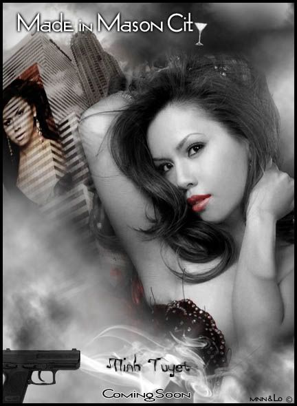
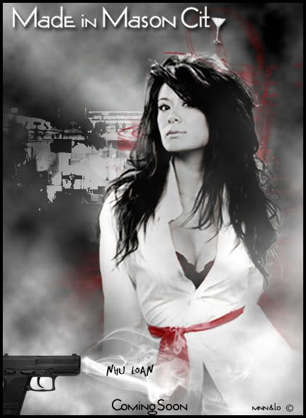
PLANNED PREQUEL Graphics
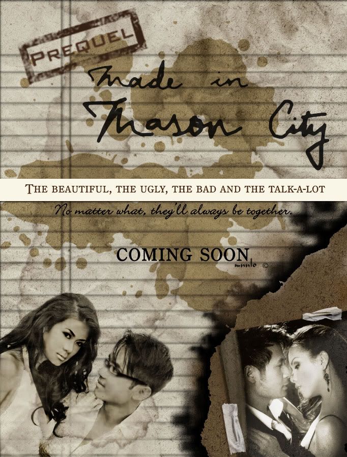
We had more promotions for the prequel than the episodes we had for it. The idea didn't work out, however, as we lost interest in it after awhile of putting it on hold due to personal reasons.
Here is a brief summary of what we had planned: The four of them went to highschool together, and part at the end of their senior year. They all left the hometown (which is NOT Mason City, and thus conflicts the name of the series, Made in Mason City) The four nicknames on the poster are supposed to be the four characters' nicknames in highschool. Nhu Loan was the Beautiful, a sweetheart, a heart-breaker, and LTQ's crush, LTQ was the Ugly (ironic :P) he was a nerd and thus didn't care about his appearance, Bang Kieu was the bad, since he was brought up by Jack and exposed to the bad side of life in his early years, and he was dating Talk-a-Lot, Minh Tuyet, who was the god of gossip and knows litterally everything that was going on inside and outside of the school.
Of course, these things are just what we had planned and has nothing with what we'll write in the future. The history of the 4 characters are all changed and is almost nothing like that of what was planned in the prequel-that-never-existed.
A Soundtrack Project That Was Never Started
We wanted to release a CD (not litterally of course) with songs selected to match the theme of Mason City and a booklet to go along with it. This is the only thing that really came out of it.
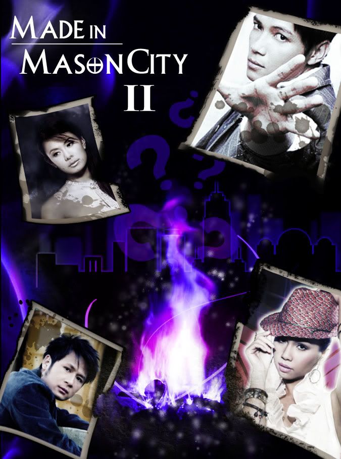
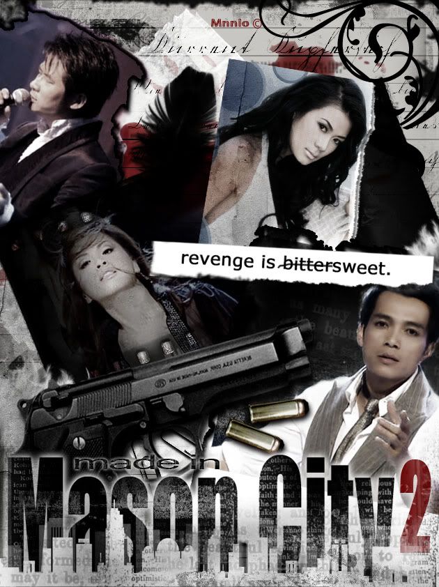
SEASON 2 Graphics
After the much-praised (and complained due to MT getting shot) season finale that recieved much attention from readers, we were excited to launch season 2. Since we were planning on releasing a prequel rather than sequel, season 2 seemed to take up a long time to prepared. However, it didn't take much longer than that of Season 1.
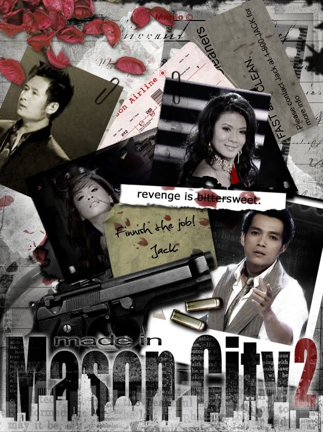
Official Poster
We approached the poster with a more realistic look this time. It shows the main focus of the season, Jack's revenge. This was supposed to be the desk or a bulletin board of the killer Jack hired, with pictures and information about his targets and other stuff like airplane tickets. (The little card with the words Cleaners on it was his ads. His job is to "clean up" anything that needed to be clean and wipe out anything that needed to be wiped) Comparing to the Season 1 Official Poster, this had gone a long way. And we are still sticking to our not-so-colorful style of graphics.
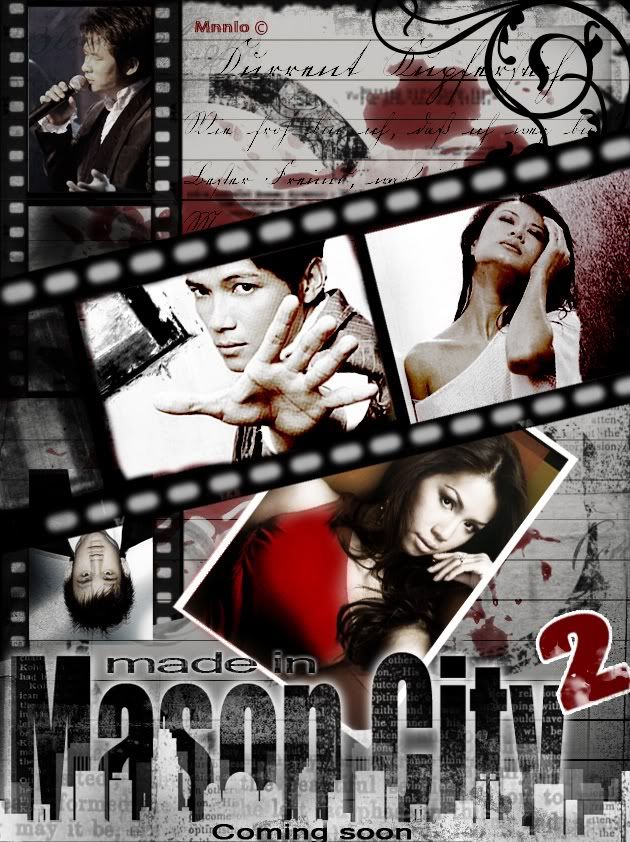
Ones that didn't make it:
Why: Well, they're simply... not good enough.
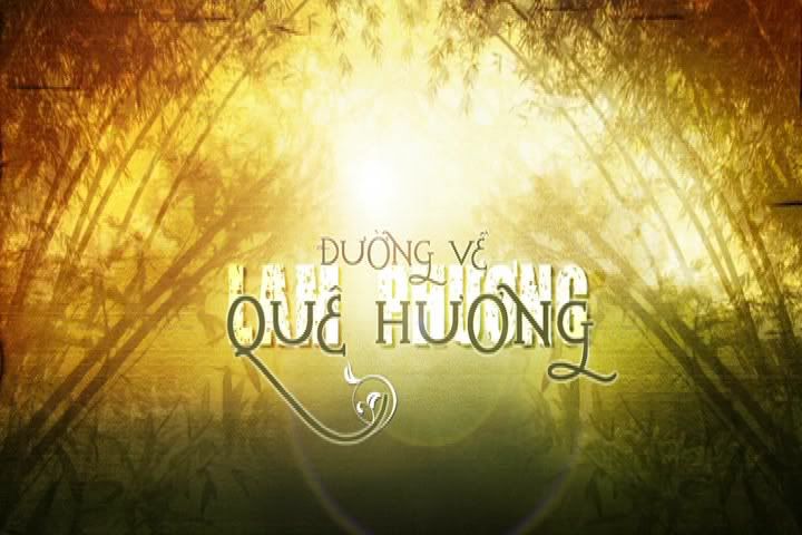
The next one will be about videos which will include a SNEAK PEEK video that will introduces a NEW character.






















Nuk ka komente:
Posto një koment